Minimap & Data Panels
QUI’s Minimap, Datatexts, and Data Panels help you move utility information out of the center of your screen and into stable utility zones.
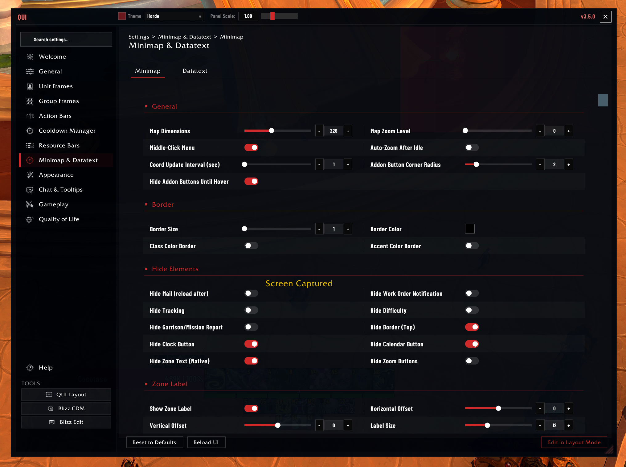 The Minimap page is where you control map dimensions, button handling, borders, labels, and other corner-HUD details.
Why Players Use It
- A cleaner minimap area with less button clutter
- Better use of screen corners for stats and utility panels
- Quick access to coordinates, clock, performance info, currencies, mail, professions, Great Vault, reputation, and alts data
- Strong visual consistency with the rest of QUI
How to Enable
The minimap and datatext modules are enabled by default. Configure them in /qui under Minimap & Datatext.
The tile is split into Minimap and Datatext so you can manage the map itself separately from the information panels around it. Use Edit in Layout Mode when you want to reposition those elements on your screen.
Best First Tweaks
- Pick a shape and size that fits your screen corners.
- Decide whether you want addon buttons hidden, shown on hover, or collected into the drawer.
- Turn on only the data panels you will actually glance at.
- Keep the corner clean enough that the minimap still reads instantly.
What You Can Customize
- Minimap shape, size, border, scale, and lock state
- Button hiding and the expandable button drawer
- Clock, coordinates, and zone text styling
- Visibility of built-in minimap elements
- Queue status eye placement
- Standalone data panels for stats, currencies, mail, professions, reputation, Great Vault, alts, and system info
- Shared currency ordering used by minimap panels, custom data panels, the Info Bar, and Bags
Important Settings
| Setting | Description | Default |
|---|---|---|
| Shape | SQUARE or ROUND | Square |
| Size | Minimap dimensions in pixels | Default |
| Border color | Class color or accent color | Accent |
| Lock position | Prevent minimap dragging | Enabled |
| Hide addon buttons | Clean up minimap border | Enabled |
| Show buttons on hover | Reveal hidden buttons on mouseover | Enabled |
| Button drawer | Collect buttons into organized panel | Disabled |
| Auto zoom out | Reset zoom after 10 seconds | Enabled |
| Clock time source | Local or server time | Local |
| Coordinate precision | Decimal places for coordinates | 1 |
Good To Know
The button drawer is the recommended way to handle addon minimap buttons. Instead of hiding them entirely or letting them clutter the minimap border, the drawer collects them into a clean panel that you can expand when needed and auto-hides after a configurable delay.
Late-created minimap buttons are rescanned when the drawer opens and when its options list is shown, so buttons that appear after login can still be collected.
Hiding the micro menu and bag bar frees up significant screen space, but make sure you know the keyboard shortcuts for the functionality they provide (e.g., opening your bags, character pane, spell book) before hiding them.
If you use the square minimap shape, the button drawer and addon button hiding become especially useful since addon buttons do not naturally distribute well around a square border.
Info Bar Relationship
The Info Bar uses the same datatext registry as minimap and custom data panels. If a datatext is available for a panel, it can usually be placed on the Info Bar too. Currency order and visibility are shared across all Currencies surfaces.