Cooldown Manager
The Cooldown Manager, or CDM, is the feature most players think of first when they think of QUI. It keeps your most important abilities, buffs, and procs near the center of your screen so you can stop glancing down at action bars every few seconds.
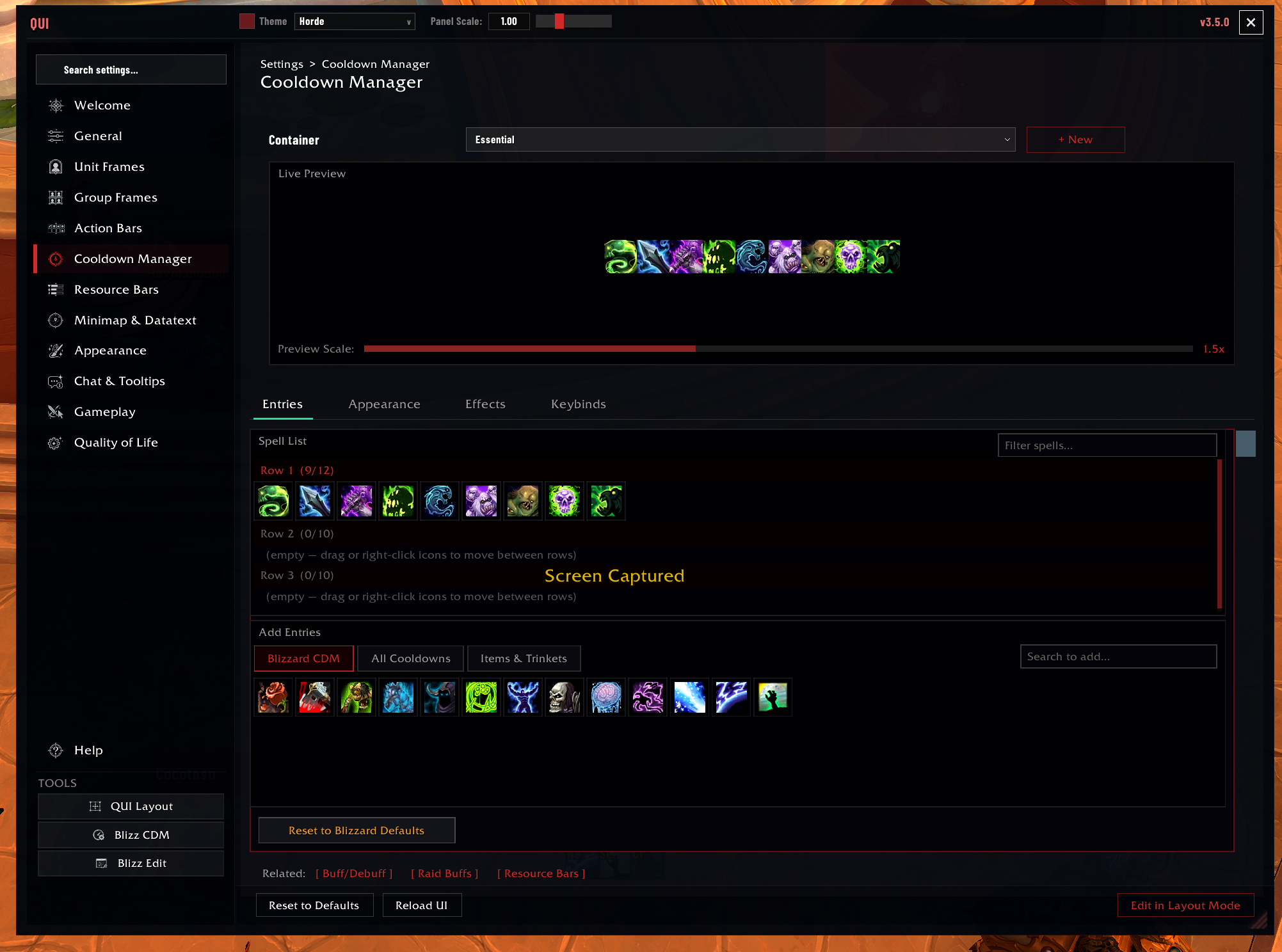 The Entries tab is where you confirm what each container tracks and add or remove spells from the live preview list.
Why Players Use It
- Your core rotation is easier to track near your character.
- Important utility and defensive cooldowns get their own space.
- Tracked buffs, debuffs, and aura bars can live in the same visual system.
- It works well for DPS, healing, support, and utility-heavy playstyles.
- Tracked entries stay user-owned; unavailable spells go dormant instead of being removed from your lists.
Where To Configure It
- Open
/quiand select Cooldown Manager. - Type
/cdmif you want to jump straight there. - Use Edit in Layout Mode only when you want to move the container on screen.
Best First Setup
- Move the Essential container to the spot your eyes naturally return to.
- Place Utility close enough to read, but far enough away that it does not compete with your main rotation.
- Open the Entries page and confirm the spells you care about are present.
- Adjust icon size before you change anything more advanced.
- Add custom entries only after the core setup already feels good.
Dormant Entries
QUI does not automatically delete tracked spells just because your current talents, spec, loadout, or hero build temporarily make them unavailable. Instead, the entry becomes dormant: hidden from the active display but still kept in your configured list.
This is especially useful while swapping talents or loadouts. When the spell becomes available again, it returns without you rebuilding the container.
How CDM Is Organized
- Essential is your main combat bar for rotation and high-priority abilities.
- Utility is usually where defensives, movement tools, interrupts, and situational buttons go.
- Aura containers track buffs and debuffs as icons.
- Aura bars track longer effects as bars when that reads better than icons.
The system automatically knows your class and specialization, then lets you refine the list from there.
What You Can Customize
- Container size, rows, spacing, and growth direction
- Which spells appear, and in what order, through the Entries page
- Per-spell overrides for visibility and effects
- Glow, swipe, range, usability, and desaturation behaviors
- Keybind display and optional click interaction
- Visibility rules so bars appear only when you want them
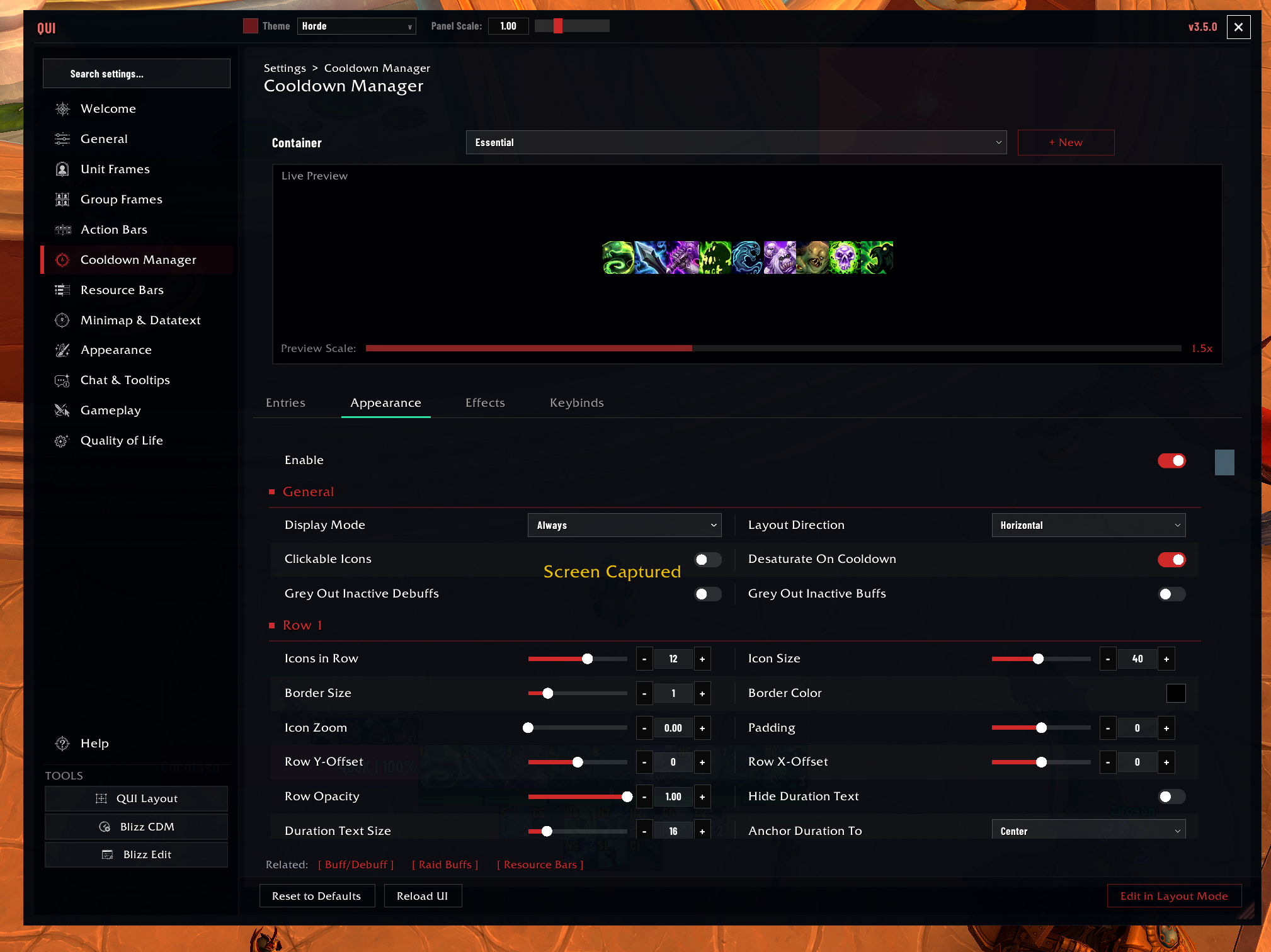 The Appearance tab is where you change icon size, layout direction, padding, text placement, and other container-level presentation choices.
Important Settings
| Setting | Description | Default |
|---|---|---|
| Essential icon size | Pixel size of Essential container icons | 39 |
| Essential icons per row | Number of icons before wrapping to a new row | 8 |
| Essential rows | Maximum number of rows (1-3) | 3 |
| Utility icon size | Pixel size of Utility container icons | 30 |
| Utility icons per row | Number of icons before wrapping | 6 |
| Layout direction | HORIZONTAL or VERTICAL | HORIZONTAL |
| Range indicator | Tint out-of-range icons red | Enabled |
| Desaturation | Desaturate icons on cooldown | Enabled |
| Show keybinds | Display keybind text on icons | Enabled |
| Clickable icons | Enable click-to-cast on CDM icons | Disabled |
Common CDM Styles
- Minimal combat HUD: one Essential row, one Utility row, very little else.
- Aura-heavy setup: add icon or bar containers for tracked buffs and debuffs.
- Role-based setup: keep healing or support cooldowns in Utility so the main bar stays readable.
Good To Know
Custom entries are stored per character, so a trinket or utility spell you add on one character will not automatically appear on another.
The Entries page is the fastest way to make CDM feel personal. Use it before chasing tiny spacing tweaks.
If you are unsure whether to track something as an icon or a bar, start with icons. Move to aura bars when duration readability matters more than button-like recognition.
The countdown number size slider is always available (2-24px). There is no longer a separate “Custom Duration Size” toggle to enable first. The countdown is drawn engine-side, so the size you pick still applies even when combat-protected values are in play.