Action Bars
QUI’s Action Bars clean up the bottom of your screen without forcing you into one rigid layout. You can keep them obvious and traditional, or fade them back and let CDM do most of the visual work.
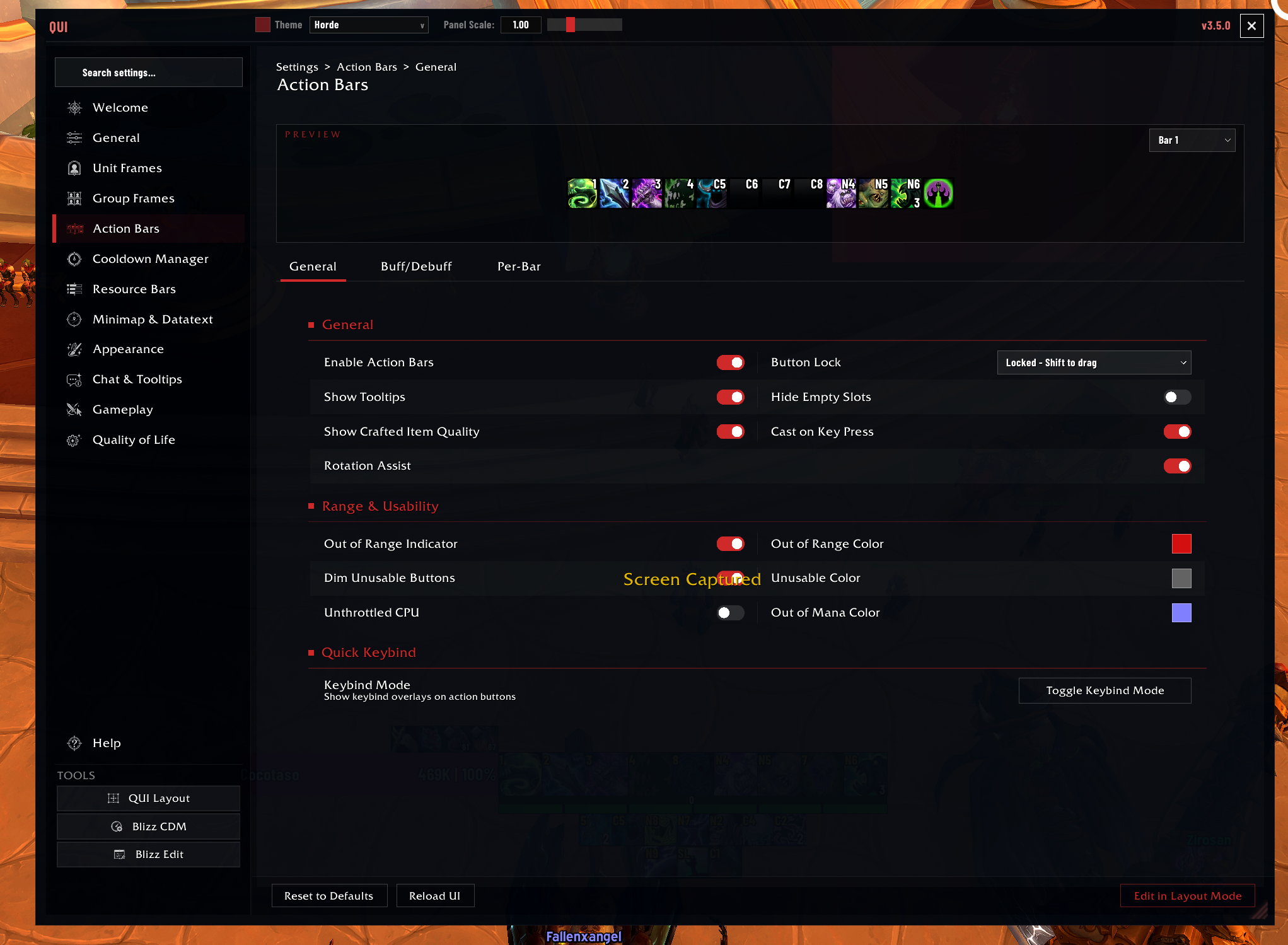 The General page handles the master action bar toggles, range and usability feedback, and quick keybind access.
Why Players Like It
- Cleaner buttons and more readable keybinds
- Mouseover fade for a minimalist HUD
- Per-bar overrides when one size does not fit all
- Better range and usability feedback than a plain default setup
- Separate enable toggles for the micro menu and bag bar
- Buff-border timers and right-click cancellation support on action buttons
How to Enable
Action bar enhancements are enabled by default. To access settings, open /qui and navigate to Action Bars.
Within that tile, the top strip is split into General, Buff/Debuff, and Per-Bar so you can decide whether you want broad changes or one-off overrides.
The micro menu and bag bar have the same Bar > Enabled style toggle as the numbered bars, and changes apply immediately when possible.
Best First Tweaks
- Decide whether you want bars always visible or mouseover-faded.
- Make sure the keybind text is readable before changing visual flourishes.
- Adjust spacing and scale so your bars feel intentional, not cramped.
- Use per-bar overrides only after the global style is close.
- Decide whether pet, stance, micro menu, and bag bar should link with your main bar fade behavior.
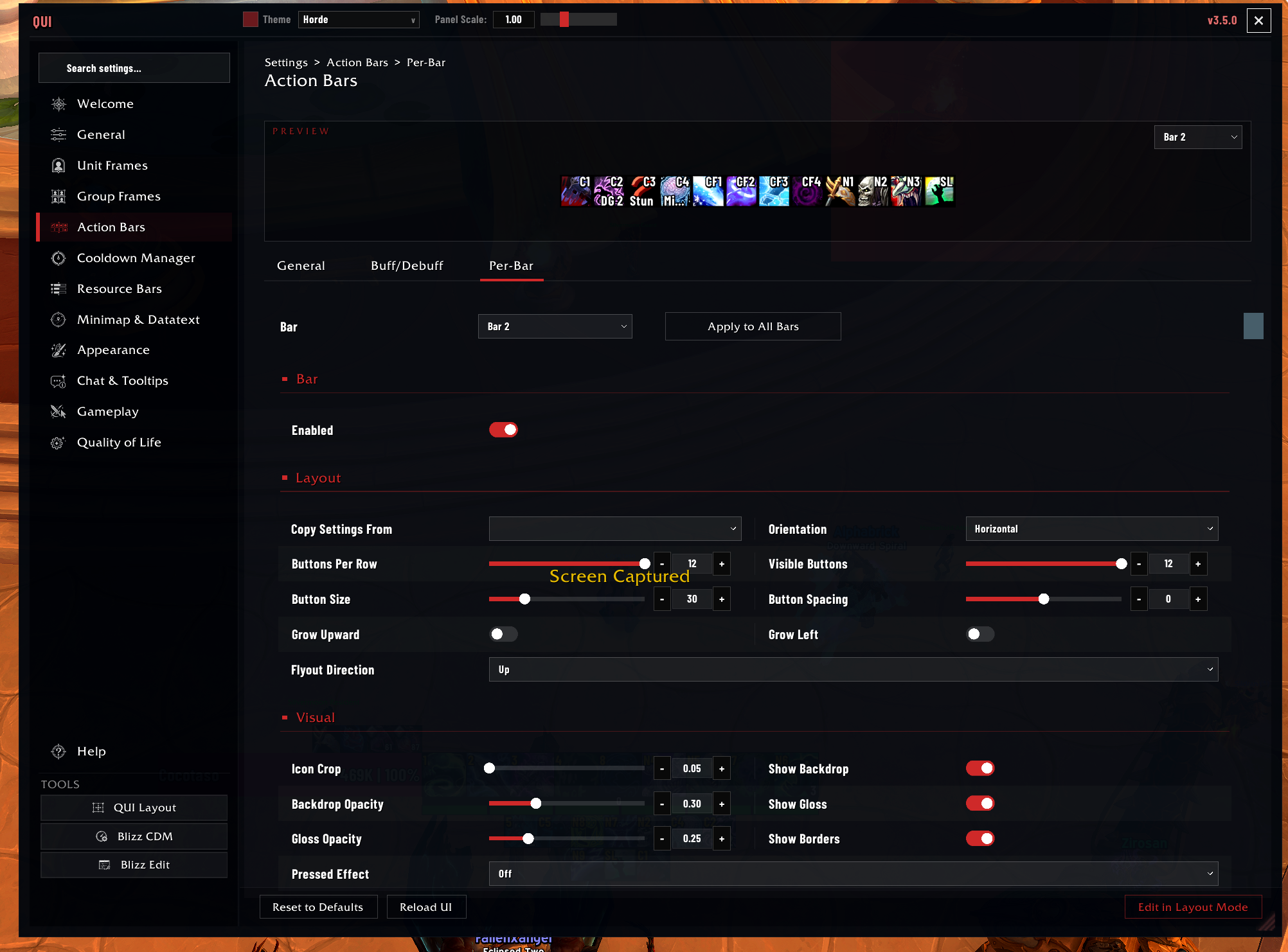 Use the Per-Bar page when one bar needs its own size, spacing, or layout without changing the rest of the setup.
What You Can Customize
- Global scale, spacing, and button styling
- Keybind, macro, and stack text presentation
- Mouseover fade timing and alpha
- Per-bar override rules for the main bars
- Range and usability indicators
- Special bars like pet, stance, bags, and vehicle-related buttons
Important Settings
| Setting | Description | Default |
|---|---|---|
| Global scale | Scale multiplier for all bars | 1.0 |
| Button spacing | Gap between buttons in pixels | 2 |
| Icon zoom | Crop icon edges for a cleaner look | Enabled |
| Mouseover fade | Fade bars when not hovered | Disabled |
| Fade out alpha | Opacity when faded (0 = invisible) | 0 |
| Always show in combat | Override fade during combat | Enabled |
| Hide empty slots | Hide buttons with no spell assigned | Disabled |
| Lock buttons | Prevent dragging spells off bars | Enabled |
| Range indicator | Tint out-of-range red | Enabled |
| Fast usability | 50ms usability checks | Disabled |
Good To Know
The mouseover fade system pairs well with QUI’s Cooldown Manager. With your rotation cooldowns visible via the CDM, you can safely fade your action bars to keep a clean HUD and still know exactly what is available.
The “fast usability updates” option polls every 50ms instead of 250ms. This makes usability coloring more responsive but uses slightly more CPU. Enable it only if the default 250ms feels sluggish for your playstyle.
Per-bar style overrides let you keep a consistent global style while making exceptions – for example, larger keybind text on bar 1, or no backdrop on your pet bar. Settings that are not overridden fall through to the global defaults.
Linking bars 1-8 for unified mouseover means you can hover any one of your main bars and all of them appear. This is useful when you stack bars vertically or arrange them in a grid.